PART 1
Our next series jumps to Presentation Design and springboards off the previous focus on speechwriting via the POWER method.
Welcome to Design with STYLE: The STYLE Method!
The pillars of Presentation Design are built on decades of neuroscience research and design theory. We’re talking specifically about the science of creating slides for presentations that will add impact and greatly increase idea retention.
But how—and why—do great slides engage people?
In short, visuals create emotions. And those emotions release dopamine in the brain, which creates deeper memory imprinting.
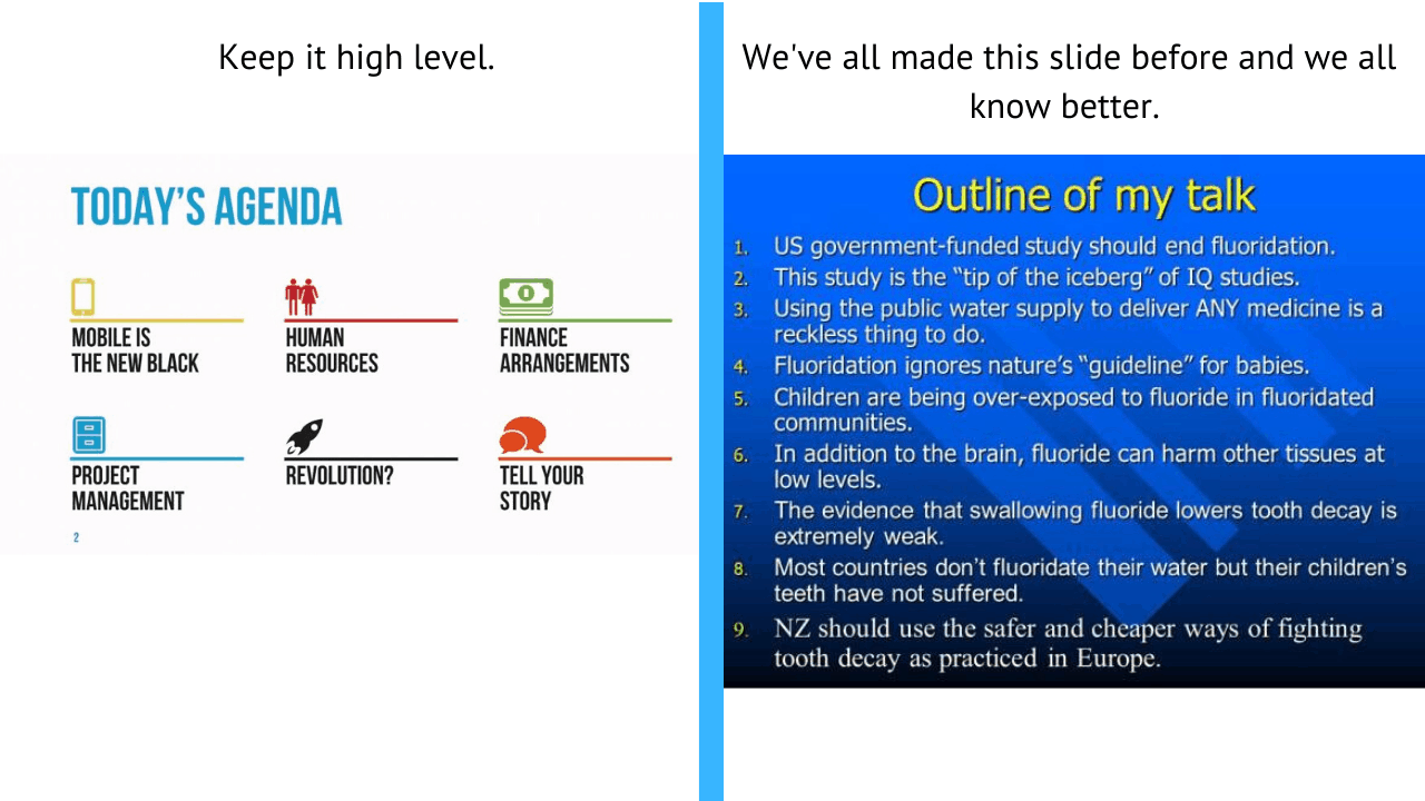
Humans process visual information incredibly fast! That means one of the worst ways to convey ideas to people is by creating slides that are simply bullets and big blocks of text.
Even worse: reading from your slides as if they were cue cards. Do this and you might as well say “goodnight” to an audience.
Instead, use visuals in slides that best represent and amplify your ideas, products, or proposals. The images can be moving. Or funny. Or cute. If a point you want to make can be made using a picture of a fluffy Bichon frise puppy playing with Christmas wrapping paper–do it! Maybe add a few words as text and you’ve got a memorable mix.
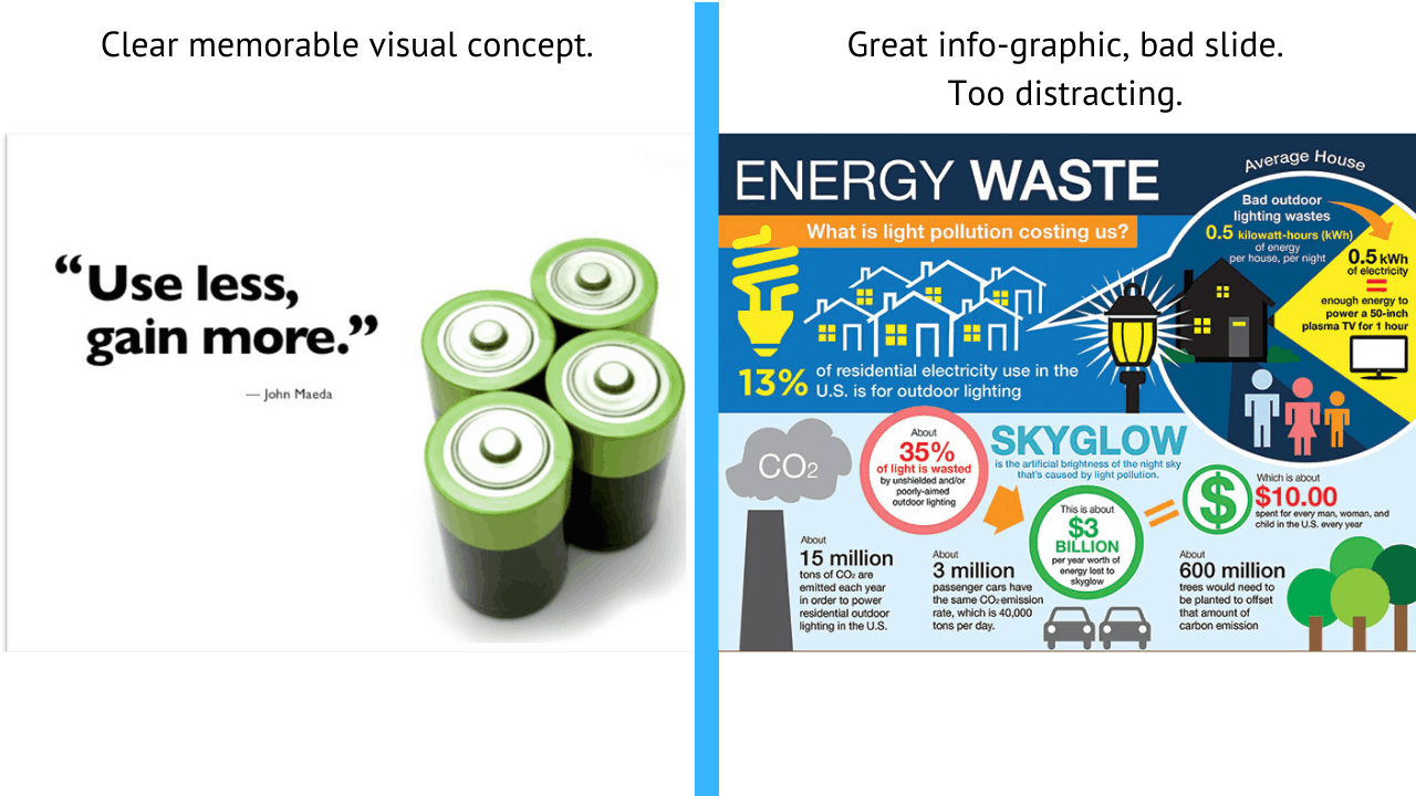
Take these slide examples below. One has a clear message for the audience to remember that the presenter can speaker to. The other is a mess, distracting, and what did they just say?.. I was too busy reading the slide to pay attention.
Table of Contents
ToggleDesign with STYLE – the STYLE method
The word STYLE is an acronym for creating the best and most memorable Presentation Design.
During this four-part series, we’ll delve into the finer points of each letter that will make you better:
S = Slide Theory. Learn how to recognize the neuroscience behind the art of visual persuasion. The Picture Superiority Effect is a real thing! Our brains process images much more quickly than blocks of text.
T = Tell Your Story. Discover the secrets of storyboarding. And you’ll agree that reading from your slides can turn your presentation into a snooze-fest. We’ll look at how to rehearse/remember what to say in conjunction with each of your dazzling slides.
Y = Your Slide Design. Yes, there are style and structure principles that go into a superior presentation. We’ll also talk tips about templates, themes, and topography. And we’ll discuss the use—and not the overuse—of color.
L = Learn Imagery and Data Visualization. It’s been true for centuries: A picture is worth a thousand words. Wouldn’t you trade that many words for one inspirational meme, or a hilarious GIF, during a presentation? Also: The ABCs of charts, graphs, and diagrams.
E = Examples. Hey, an acronym has to spell something to be effective. Lastly, we’ll look at highly effective examples of everything disseminated in the STYLE method.
Read on to get going on the best presentation method out there:
Great Presentation Design Begins With “S” Slide Theory
Again, Slide Theory is based on scientific research. It looks into the neuroscience of persuasion.
Realize that humans have many barriers to retention of information, including:
- Motivation
- Stress
- Amount of content being delivered
- And more
Our brains forget information rapidly, and sometimes randomly.
That’s why brevity and impactful visuals coupled with your masterful delivery and audience engagement are important.
So take into account the Picture Superiority Effect. As mentioned above, images are more likely to be remembered than words.The way the brain processes images: It can recognize images 65 percent more quickly than text.
After you’ve got your talk fleshed out, it’s time to bring your words to life. That doesn’t mean writing your speech on slides and reading the slides to your audience. Do that and get ready for the snoring to begin.
Rather, pick out visuals that best represent the ideas your words represent.
The focus should be on clear, simple and engaging slides. That also goes for charts, graphs anything else you’re going to project onto a big screen with the goal of being persuasive, winning hearts and achieving maximum retention.
Neuroscience research points to ways to attract people’s senses. You can grab attention with brightness, color, motion, size, depth and sound. In the brain, these are all gateways to information that proceeds to higher levels of analysis.
With careful use of these gateways, attention to a stimulus can help focus attention on an idea. For example: the use of color. Say you have four umbrellas on a slide. If three are black and one is red, which one will the audience zero in on? Yes, of course, the red one.
Slide Theory Puts the Power in PowerPoint and Slide Design
Researchers have found that ideas are best remembered when presented as pictures rather than words.
Pictures paired with words work great, too. According to the Picture Superiority Effect, after three days, an audience typically remembers 10 percent of an oral presentation. That number jumps to 65 percent if you add an image.
That doesn’t mean any old photo will do the trick.
Ugly or overloaded slides can confuse an audience. Visual design should support each particular point you are making. And the images should also appeal to people’s emotions.
For example: Say you’re raising money for street improvements. A text-heavy photo of a list of upgrades isn’t as emotive as a closeup of a mom and her toddler walking along a clean city street.
Slides presented to an in-person audience should also be as simple as possible. That is, they should be on-topic—but not so complex that they distract the crowd from listening to what you have to say.
A bar chart with three columns makes the point more clearly than the same chart filled with arrows, multiple thought bubbles and a long list of references in tiny font.
Let the images on your slides work for you—not fight you for attention, or, even worse, cause your audience to zone out.
An important point to keep in mind is image quality. A fuzzy or low-resolution photo is no good. Neither is a shot that’s cropped too wide so you can’t see your product in the model’s hands.
Presentation Design Services
Slide Over Here and Let Us Help!
Whether you need an expert hand with presentation design individually or as a team, we can help you with:
- Business Presentation and Slide Design
- Presentation Design Coaching
- Design Team Training and Workshops
- Slide Review Services
Next Up: T = Tell Your Story
Check out the second part of Design with STYLE – the STYLE method of Presentation Design. With T = Tell Your Story, we’ll discuss: The art of storyboarding. Like any dramatic or artistic presentation, there’s a rhythm and a flow that goes into its design. Slides are not teleprompters. Reading off your slides during a presentation is ineffective. A big no-no. We’ll look at ways to rehearse and remember what to say when the bullets are not copied onto your slides.
TAKE THE FIRST STEP TO MASTER POWERFUL NEW SKILLS
Schedule an easy 30-minute call using our calendar. We’re here to help!

