PART 3
The third installment in our Presentation and Slide Design series is a deep dive into great presentation design.
The focus is on creating compelling slides that allow an audience to easily absorb your information.
Welcome to Part 3 of Design with STYLE – The STYLE Method
In Part 2, we learned how Presentation and Slide Design is aided by storyboarding. That process allows you to put key points in order, edit out unnecessary parts and visualize each of your slides to accompany your script.
Now, we’re revealing style and structure tools that will help you design slides that convey the big picture to your audience. Imagine you’re a movie director. You have the vision. Your actors and crew need to be coached to tell a coherent story. Think of presentation slides as actors in your movie. You can make them bigger or louder, zoom in for a closeup or pick a different camera angle to create a poignant scene. And…action!
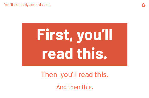
Your slides shouldn’t contain obstacles—like long blocks of text—and the visuals should help tell a story that’s easy to follow and comprehend. Example: You’ve heard that “bigger is better,” right? Well, on a slide, “bigger gets read first.”
As we progress into “Y” Your Design, the goal is to master the basics of fonts and text, learn the creative uses of color, and comprehend how “visual hierarchy” can orient viewers’ eyes in a specific direction. Slide design is a key part of getting an audience to react to your story or pitch!
Table of Contents
ToggleHandling Text & Color Like A Designer
Using text correctly on slides is hardly a simple task. Text—used sparingly—affects the way an audience perceives a message and the way the message will be processed.
Designers know that uppercase letters, short titles and not-complete sentences are best tactics for understandable text. Other factors include:
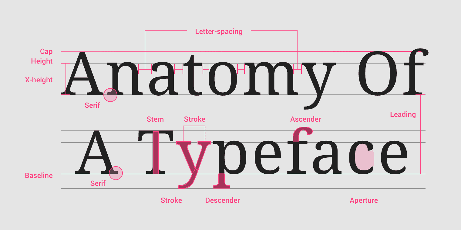
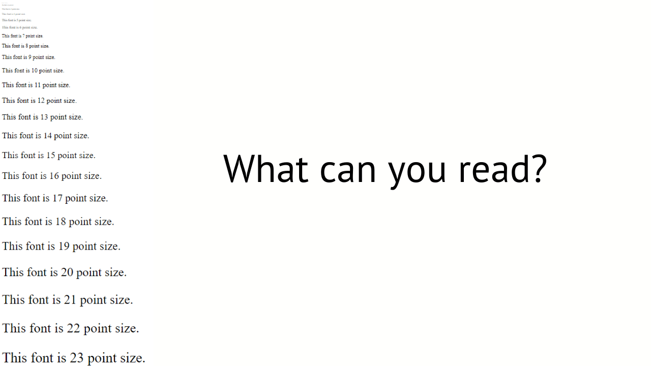
1. Point (font) size.
Don’t create text that’s too small to read—especially for presentations in large venues.
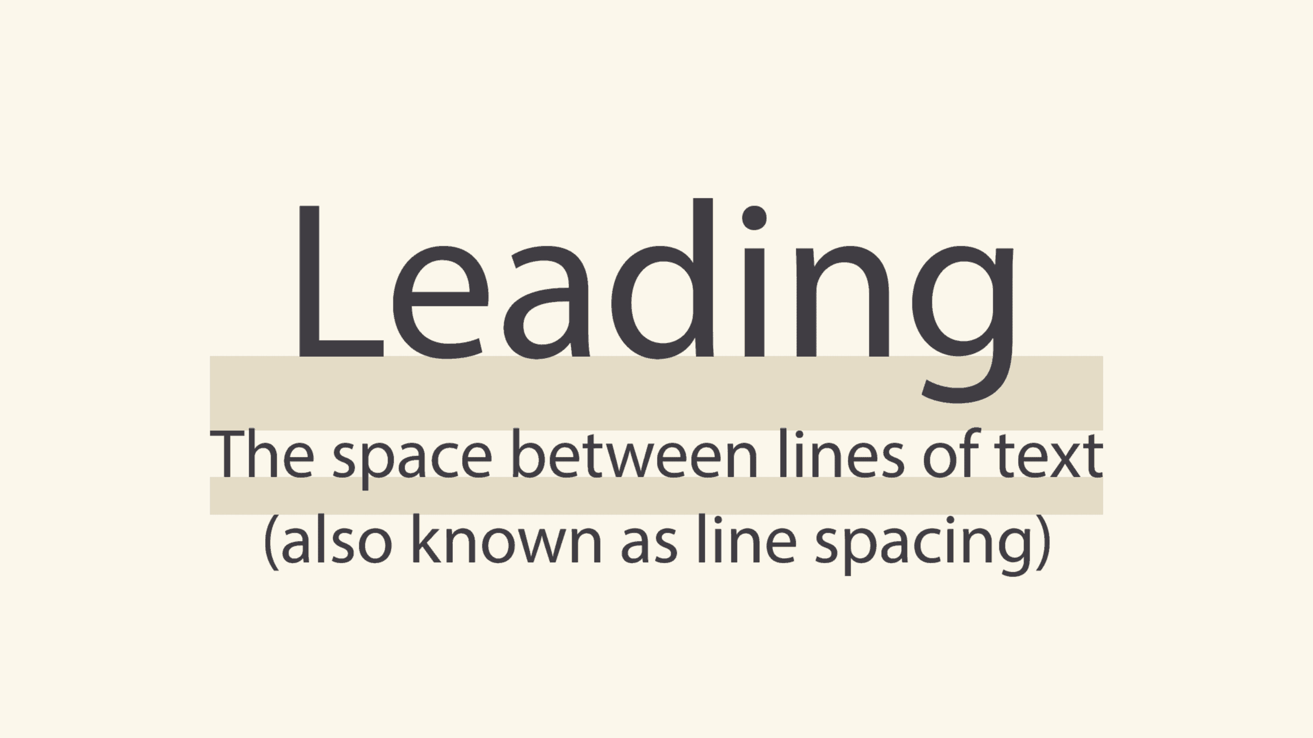
2. Leading.
This refers to the amount of space between lines of text. Too little leading is hard to read; too much leading can look unorganized and be confusing.
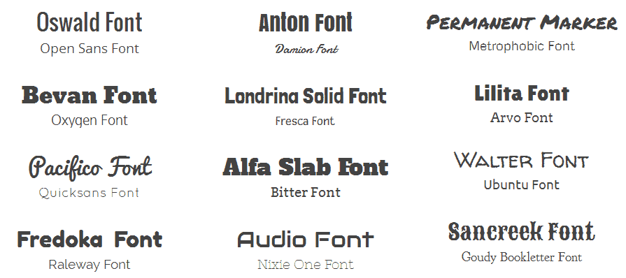
3. List your favorite fonts.
To save time, create a selection of fonts from the broad list of options that are available. No need to recreate the wheel for every presentation.
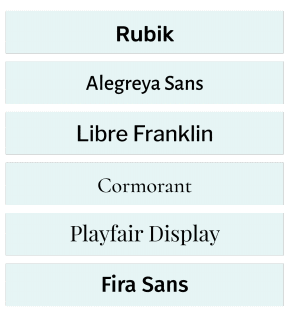
4. Pairing fonts.
There’s an art to pairing fonts that involves using ones from the same typeface. Example: Choose one font family and use a bold, bigger version for the headline and a thinner, smaller variation for the subhead.

5. Color.
The use of color can be powerful. Research shows colors can greatly improve learning and comprehension. Warm colors communicate energy, optimism and enthusiasm. Cool colors send a message of dependability, professionalism and peace.
Each color is associated with an emotion or a concept—though this can depend on cultural context. For example, red can mean passion and love in the West, but in China it symbolizes prosperity.
Some common (Western) color associations include:
- Black: power, sophistication, mystery, death.
- White: hope simplicity, cleanliness, goodness, purity.
- Blue: peace, sincerity, confidence, integrity, tranquility.
- Green: life, growth, nature, money, freshness.
“Y” Your Design: Visual Hierarchy
The goal of captivating visual design is to connect with an audience by making them work as little as possible to comprehend your message.
There is a ton of theory behind design principles. You may not have time to digest all of it, but here are some basic tenets of visual hierarchy:
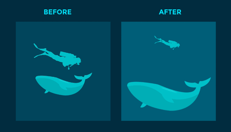
Size objects according to importance.
The most important elements should be larger and more prominent than less important ones. Elements shouldn’t compete for attention and a viewer should know where to look first.
Create an illusion of depth using background images and color.
By creating an illusion of depth, you can make elements in your design “pop.” Example: Blur the background and make one element clear and distinct in the foreground.
Use contrast to attract viewers’ eyes.
Our eyes notice differences—whether this is color, shape, texture, size or position. Example: Choose one word in a line of text to be a different color than the rest.
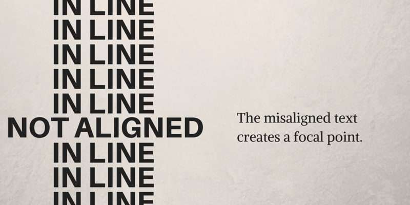
Create alignment to direct the eyes of an audience.
Alignment is part of the structure by which elements are placed in a design. Simple visual designs align in the center of a frame—but not all designs are perfectly symmetrical.
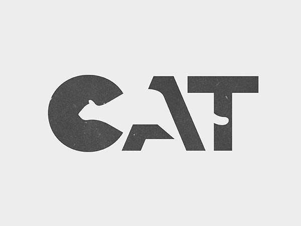
Create negative space to emphasize elements.
Negative space, or white space, lets readers’ eyes rest and can help draw attention to the main element in a design.
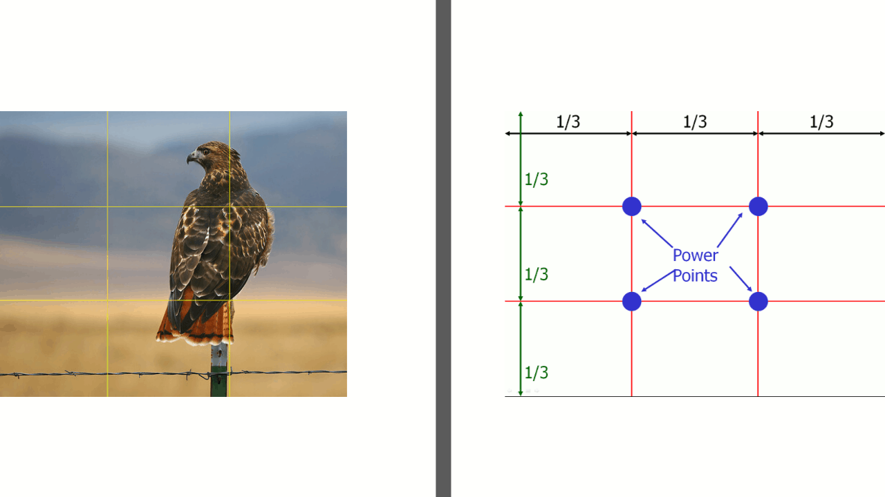
Use the “rule of thirds” to create a focal point.
The rule involves mentally dividing a slide into a grid with two vertical and two horizontal lines (creating nine sections). Important elements are placed along the lines, emphasizing where the lines meet.
Hey, you’re a pro at what you do, and that’s not necessarily slide design. We train individuals or teams to create the best and most appropriate slide design and structure. Or, we’ll do it for you, to your preferred specifications!
Presentation Design Services
Slide In Safely and Let Us Help!
When you need professional assistance with presentation design – individually or as a team – Moxie Institute can help you with:
· Business Presentation and Slide Design
· Presentation Design Coaching
· Design Team Training and Workshops
· Slide Review Services
“L” = Learn Imagery & Data Visualization! and “E” = Examples!
In our next blog we’ll wrap up the STYLE Method by covering both the “L” = Learn Imagery & Data Visualization and “E” = Examples. Yes, a picture is worth a thousand words. One great image or meme is absolutely worth that number of words during a presentation. Along with the ABCs of charts, graphs and diagrams, the last lesson in our series will include highly effective examples of great imagery. You’ll also visualize that our presentation design services can help you achieve your goals!
TAKE THE FIRST STEP TO MASTER POWERFUL NEW SKILLS
Schedule an easy 30-minute call using our calendar. We’re here to help!

